Chart Presentation Tool
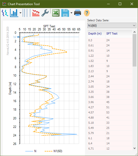
We understand that presentation of the analysis results is very important to our users. Everywhere in Novo Tech Software programs when you click on a chart, a new dialog appears showing the chart and its data. In the following example, the corresponding dataset is shown on right, and can be scrolled vertically to view all data. In addition, toolbar buttons provide you with more features:
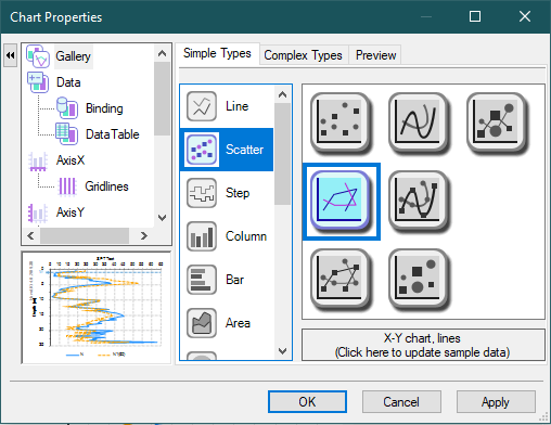
Changing the Appearance of the ChartYou can configure almost everything in the charts by clicking on
Click on the desired setting from the left, and apply changes as needed. |